Table of Contents
In this post, I’ll show you how the nested stochastic block model (nSBM) can extract insights from correlation matrices using a combination with a filtering edge graph technique called disparity filter. I’ll use as a case study a correlation matrix derived from the stock market data.
Don’t be afraid, you will reproduce the beautiful plot presented below and understand what it means.
If you want to reproduce, use a conda environment because of the graph-tool dependency. Besides that, check if you have the following packages installed:
matplotlib, pandas, yfinance
Probably you will need to install the igraph package
$ pip install python-igraph
Now, install the graph-tool made by
Tiago Peixoto.
$ conda install -c conda-forge graph-tool
No less important, we will need to remove weakling edges from the graph. To do so, we will use my package, edgeseraser. The repository of the project is available here:
devmessias/edgeseraser. To install the edgeseraser run the following command:
$ pip install edgeseraser
Introduction
Exploratory data analysis allows us to gain insights or improve our choices of the next steps in the data science process. In some cases, we can explore the data assuming that all the entities are independent of each other. What happens when it’s not the case?
Graphs
A graph is a data structure used to store objects (vertexes) with binary relationships. Those relationships are called edges.
Each edge can have generic data associated with it. Like a numeric value.
Maybe you can think that this data structure is rare in the world of data. But
if you look carefully at the data spread on the internet, graphs are everywhere: social networks, economic transactions, correlation matrices and many more.
Correlation matrices
A correlation matrix is a storing mechanism that quantifies relationships between pairs of random variables.
Thus, a correlation matrix is at least a weighted graph. The main point of this post is to show how we can use tools of network science to analyze the correlation matrix. Ok, but maybe you’re asking: Why do we need to do this?
Correlation matrices are commonly used to discover and segment the universe of possible random variables. With this segmentation into groups (clustering) we can analyze the dataset in a granular way. Therefore, improving our efficiency in discarding unnecessary information.
A widely spread way to analyze correlation matrices using graph analytics is through the use of minimum spanning trees. I won’t go into details about this method (check the following posts Networks with MlFinLab: Minimum Spanning and [Dynamic spanning trees in stock market networks:
The case of Asia-Pacific]( https://www.bcb.gov.br/pec/wps/ingl/wps351.pdf)) because I want to show how we can use a different technique that at the same time is more flexible and powerful when we want to understand the hidden group structure of a correlation matrix.
This technique is called the nested stochastic block model (nSBM) and it’s a probabilistic model that allows us to infer the hidden group structure of a graph. The nSBM is a generalization of the stochastic block model (SBM) that assumes that the graph is composed of a set of communities (groups) that are connected by a set of edges. The SBM is a generative model that allows us to generate graphs with several communities. This generative model also creates those communities using parameters that describe the probability of a connection between vertices living in the same or different communities. Although the SBM is a powerful tool to analyze the structure of a graph, it’s not enough to infer the small communities (small groups of stocks) in our graph. To do so, we need to use the nSBM.
Ok, let’s go to the actual stuff and code.
Downloading and preprocessing the data
Closing prices of the S&P 500
Let’s import what we need
import yfinance as yf

import pandas as pd

import numpy as np

import matplotlib.pyplot as plt

import matplotlib as mpl

import igraph as ig

from edgeseraser.disparity import filter_ig_graph
To keep things simple, I choose to use the following data available here. This data encompasses the S&P500 from a specific time with symbols and sectors like this:
| Symbol | Name | Sector |
| —— | ——————- | ———– |
| MMM | 3M | Industrials |
| AOS | A. O. Smith | Industrials |
| ABT | Abbott Laboratories | Health Care |
| ABBV | AbbVie | Health Care |
!wget https://raw.githubusercontent.com/datasets/s-and-p-500-companies/master/data/constituents.csv
After downloading the data we just need to load it into a pandas dataframe.
df = pd.read_csv(“constituents.csv”)

all_symbols = df[‘Symbol’].values

all_sectors = df[‘Sector’].values

all_names = df[‘Name’].values
The following dictionaries will map the symbols to sectors and names later on
symbol2sector = dict(zip(all_symbols, all_sectors))

symbol2name = dict(zip(all_symbols, all_names))
Time to download the information about each symbol. Let’s request one semester
of data from yahoo finance API
start_date = ‘2018-01-01’

end_date = ‘2018-06-01’

try:

    prices = pd.read_csv(

        f"sp500_prices_{start_date}_{end_date}.csv", index_col="Date")

    tickers_available = prices.columns.values

except FileNotFoundError:

    df = yf.download(

        list(all_symbols),

        start=start_date,

        end=end_date,

        interval="1d",

        group_by=’ticker’,

        progress=True

    )

    tickers_available = list(

        set([ticket for ticket, _ in df.columns.T.to_numpy()]))

    prices = pd.DataFrame.from_dict(

        {

            ticker: df[ticker][“Adj Close”].to_numpy()

            for ticker in tickers_available

        }

    )

    prices.index = df.index

    prices = prices.iloc[:-1]

    del df

    prices.to_csv(

        f"sp500_prices_{start_date}_{end_date}.csv")
Returns and correlation matrix
We first start by computing the percentage of price changes for each stock, the return of each stock.
returns_all = prices.pct_change()

# a primeira linha não faz sentido, não existe retorno no primeiro dia

returns_all = returns_all.iloc[1:, :]

returns_all.dropna(axis=1, thresh=len(returns_all.index)//2., inplace=True)

returns_all.dropna(axis=0, inplace=True)

symbols = returns_all.columns.values
Now, we compute the correlation matrix using the returns
# plot the correlation matrix with ticks at each item

correlation_matrix = returns_all.corr()

plt.title(f"Correlation matrix from {start_date} to {end_date}")

plt.imshow(correlation_matrix)

plt.colorbar()

plt.savefig(“correlation.png”, dpi=150)

plt.clf()
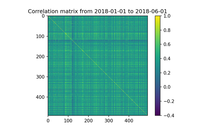
Ok, look into the image above. If you try to find groups of stocks that are less correlated just using visual inspection, you will have a hard time. This works just for a small set of stocks. Obviously, that is another approach like using linked cluster algorithms, but they are still hard to analyze when the number of stocks increases.
Removing irrelevant correlations with the edgeseraser library
Our goal here is to understand the structure of the stock market communities,
so we will keep just the matrix elements with positive values.
pos_correlation = correlation_matrix.copy()

# vamos considerar apenas as correlações positivas pois queremos

# apenas as comunidade>

pos_correlation[pos_correlation < 0.] = 0

# diagonal principal é setada a 0 para evitar auto-arestas

np.fill_diagonal(pos_correlation.values, 0)
Now, we create a weighted graph where each vertex is a stock and each positive correlation is a weight associated to the edge between two stocks.
g = ig.Graph.Weighted_Adjacency(pos_correlation.values, mode=’undirected’)

# criamos uma feature symbol para cada vértice

g.vs[“symbol”] = returns_all.columns

# o grafo pode estar desconectado. Portanto, extraímos a componente gigante

cl = g.clusters()

g = cl.giant()

n_edges_before = g.ecount()
The graph above has too much information, which is problematic for graph analysis. So, we must first identify and keep only the relevant edges. To do so, we use the disparity filter.
available in my edgeseraser package.
_ = filter_ig_graph(g, .25, cond="both", field="weight")

cl = g.clusters()

g = cl.giant()

n_edges_after = g.ecount()
print(f"Percentage of edges removed: {(n_edges_before - n_edges_after)/n_edges_before*100:.2f}%")

print(f"Number of remained stocks: {len(symbols)}")

...

Percentage of edges removed: 95.76%

Number of remained stocks: 492
We have deleted most of the edges and only a backbone remained in our graph. This backbone structure can now be used to extract.
insights from the stock market.
nSBM: fiding the hierarquical structure
Converting from igraph to graph-tool
Here, we will use the graph-tool lib to infer the hierarchical structure of the graph. Thus, we must first convert the graph from igraph to graph-tool. We can convert that using the following code
import graph_tool.all as gt

gnsbm = gt.Graph(directed=False)

# iremos adicionar os vértices

for v in g.vs:

    gnsbm.add_vertex()

# e as arestas

for e in g.es:

    gnsbm.add_edge(e.source, e.target)
How to use the graph-tool nSBM?
With the sparsified correlation graph that encompasses the stock relationships, we can ask ourselves how those relationships ties stocks together. Here, we will use the nSBM to answer this.
The nSBM
is an inference method that optimizes a set of parameters that defines a generative graph model for our data. In our case, to find this model for the sparsified s&p500 correlation graph, we will cal the method minimize_nested_blockmodel_dl
state = gt.minimize_nested_blockmodel_dl(gnsbm)
We can use the code below to define the colors for our plot.
symbols = g.vs[“symbol”]

sectors = [symbol2sector[symbol] for symbol in symbols]

u_sectors = np.sort(np.unique(sectors))

u_colors = [plt.cm.tab10(i/len(u_sectors))

          for i in range(len(u_sectors))]

# a primeira cor da lista era muito similar a segunda,

u_colors[0] = [0, 1, 0, 1]

sector2color = {sector: color for sector, color in zip(u_sectors, u_colors)}

rgba = gnsbm.new_vertex_property(“vector<double>“)

gnsbm.vertex_properties[‘rgba’] = rgba

for i, symbol in enumerate(symbols):

    c = sector2color[symbol2sector[symbol]]

    rgba[i] = [c[0], c[1], c[2], .5]
Calling the draw method, we create a plot with the nSBM result. You can play a little, changing the `$\beta \in (0, 1)$ parameter to see how the things change. This parameter controls the strength of the edge-bundling algorithm.
options = {

    ‘output’: f’nsbm_{start_date}_{end_date}.png’,

    ‘beta’: .9,

    ‘bg_color’: ‘w’,

   #’output_size’: (1500, 1500),

    ‘vertex_color’: gnsbm.vertex_properties[‘rgba’],

    ‘vertex_fill_color’: gnsbm.vertex_properties[‘rgba’],

    ‘hedge_pen_width’: 2,

    ‘hvertex_fill_color’: np.array([0., 0., 0., .5]),

    ‘hedge_color’: np.array([0., 0., 0., .5]),

    ‘hedge_marker_size’: 20,

    ‘hvertex_size’:20

}

state.draw(**options)
Finally, we can see the hierarchical structure got from our filtered graph using
the nSBM algorithm.
plt.figure(dpi=150)
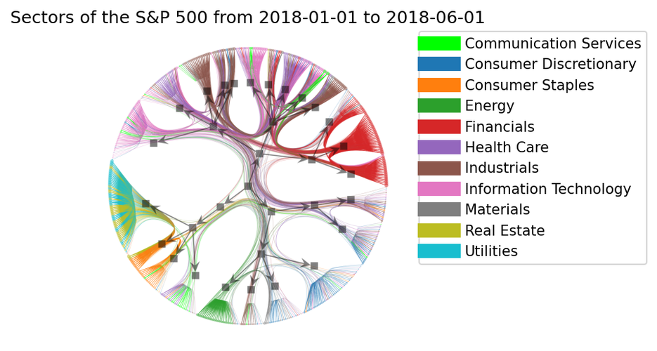
plt.title(f”Sectors of the S&P 500 from {start_date} to {end_date}")
legend = plt.legend(
[plt.Line2D([0], [0], color=c, lw=10)
for c in list(sector2color.values())],
list(sector2color.keys()),
bbox_to_anchor=(1.05, 1),
loc=2,
borderaxespad=0.)
plt.imshow(plt.imread(f’nsbm_{start_date}_{end_date}.png’))
plt.xticks([])
plt.yticks([])
plt.axis(‘off’)
plt.savefig(f’nsbm_final_{start_date}_{end_date}.png’, bbox_inches=’tight’,
dpi=150, bbox_extra_artists=(legend,), facecolor=’w’, edgecolor=’w’)
plt.show()
Wow, beautiful, isn’t it? But maybe you can only see a beautiful picture and not be
able to understand what is happening. So, let’s try to understand what this plot is
telling us.
How to analyze?
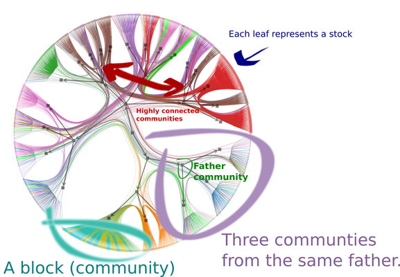
-
Each circle (leaf) represents a stock. A vertex in the original graph.
-
Each group of leafs which resembles a broom is a community detected by the nSBM.
Navigating backwards through the arrows, we can see the hierarchical community structure. The image above shows three communities that belong to the same grandfather community.
We can see interesting stuff in the community structure. For example, most stocks related to Consumer staples, Real state, and Utilities belongs to the same community.
What is the meaning of the edges?
- A larger number of edges between Financials, Industrials and Information technology survive the filtering technique, which shows a strong relationship between these sectors.
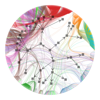
The visual inspection of the edges relationships is meaningful only because of the use of edge bundling algorithm. Let’s see how a weak bundling turns our job into a hard one, setting $\beta = 0.5$
A visual inspection is sometimes not enough, and maybe you need to create an automatic analysis, which is easy to do with the graph-tool. For example, to get a summary of the hierarchical community structure got by the nSBM algorithm, we can call the print_summary method.
state.print_summary()
l: 0, N: 483, B: 25

l: 1, N: 25, B: 6

l: 2, N: 6, B: 2

l: 3, N: 2, B: 1

l: 4, N: 1, B: 1
In the first level, we have 21 communities for all the 11 sectors.
If we want to know which communities the TSLA stock belongs to, we go through
the hierarchy in the reverse order,
# esse é o indice da TSLA no nosso grafo original

symbol = “TSLA”

index_tesla = symbols.index(symbol)

print(symbol, symbol2sector[symbol], symbol2name[symbol])

r0 = state.levels[0].get_blocks()[index_tesla]

r1 = state.levels[1].get_blocks()[r0]

r2 = state.levels[2].get_blocks()[r1]

r3 = state.levels[3].get_blocks()[r2]

(r1, r2, r3)
(‘TSLA’, ‘Consumer Discretionary’, ‘Tesla’)

(19, 0, 0)
Conclusion
The aim of this post was to give you a first impression of a method that combines the use of nSBM and edge filtering techniques to enhance our understanding of the correlation structure of the data, especially with financial data. However, we can also use this method in different scenarios, as
Bruno Messias
Ph.D Candidate/Software Developer
Free-software enthusiast, researcher, and software developer. Currently, working in the field of Graphs, Complex Systems and Machine Learning.